

Avoid overused web design trends like autoplay videos, intrusive popups, tiny fonts, complicated menus, and slow websites on your membership site; instead, use user-friendly videos, timed popups, clear typography, simple navigation, and fast-loading pages to enhance visitor satisfaction and retention.When visitors feel completely at ease—finding exactly what they need effortlessly and enjoying every moment they spend more time exploring your pages.
Interestingly, recent surveys suggest that smoother, friendlier websites have up to 80% better member retention compared to sites that use outdated or frustrating design choices. Take, for example, a membership directory that switched from overly complex menus to simple, intuitive navigation and saw member registrations nearly double within weeks.
Making thoughtful design choices is your key to happy visitors and thriving communities. To create a welcoming membership site where visitors love spending their time, here are five web design trends best left behind—and cheerful ways to replace them with enjoyable alternatives.
1. Why Should You Say Goodbye to Autoplay Videos?
Autoplay videos were trendy once, but today they feel intrusive and disruptive. Your visitor clicks your link, eager to explore—and suddenly loud videos start playing without permission, causing panic clicks to mute or close the tab altogether. Not exactly welcoming, right?
Instead, offer your visitors control by placing an inviting thumbnail that encourages them to click and watch on their terms. Visitors appreciate choices, so give them the power to decide when and how to engage with your video content. Subtitles can also enhance accessibility and user experience significantly.
Here are some user-friendly alternatives to autoplay videos:
- Mute videos by default and let visitors turn on sound voluntarily.
- Create engaging thumbnails that clearly describe video content.
- Include optional captions to accommodate all viewing preferences.
2. Is Your Website’s Popup Strategy Hurting Visitor Retention?
Popups might seem effective initially, but nothing annoys users more than aggressive popups appearing seconds after landing on a site. Imagine reading important content when suddenly—bam—a huge popup appears and refuses to close easily. It’s frustrating enough to make visitors leave immediately.
Instead, use subtle, timely popups that add genuine value. For example, display a special offer or newsletter signup after visitors have spent some time exploring. Respectful, carefully timed popups significantly improve user satisfaction and conversions.
Follow these simple tips to improve your popup strategy:
- Make closing popups quick and effortless with clearly labeled exit buttons.
- Delay popups until visitors engage meaningfully (like scrolling down or staying longer than 30 seconds).
- Offer genuine value that visitors feel happy to interact with, rather than just pushing promotions.
3. Is Small, Hard-to-Read Text Driving Your Visitors Away?
Tiny fonts seem sleek at first glance, but in reality, they just irritate visitors and strain their eyes. Hard-to-read text sends a clear message: your site doesn’t care about visitor comfort. And frustrated readers won’t stick around—they’ll head straight to your competitors.
Make readability your top priority by selecting clear, larger fonts and comfortable line spacing. Aim for a pleasant reading experience that invites visitors to explore more deeply rather than scaring them off.
Consider these helpful guidelines for font readability:
- Use fonts sized 16 pixels or larger to ensure easy readability.
- Choose clean, simple fonts without unnecessary decorative elements.
- Ensure enough contrast between text and background for maximum clarity.
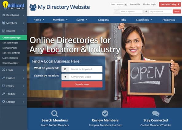
4. Are Complicated Menus Causing Your Visitors Frustration?
Some membership websites try too hard, stuffing menus full of endless dropdowns and submenus that confuse rather than guide visitors. This overcomplication turns simple tasks into frustrating chores, reducing site engagement dramatically.
Keep menus straightforward and intuitive, clearly showing visitors exactly where to find what they need quickly. Simple navigation structures enhance user satisfaction, driving repeat visits and higher signups.
Here’s how to simplify your navigation menus:
- Label menu items clearly with short, understandable terms.
- Limit dropdown menus to essential categories, avoiding clutter.
- Always include an easy-to-spot search feature, making everything quickly accessible.
5. Is Your Website Stuck in the Past and Painfully Slow?
Slow-loading websites aren’t just outdated—they actively repel visitors. A sluggish website not only frustrates users, but it also significantly damages your site’s credibility. Visitors expect quick loading times and won’t stick around for a site that feels like it’s still living in 2010.
Refresh your membership site’s technology, optimize images, and streamline coding. Prioritize responsive designs to ensure every page loads smoothly, no matter what device visitors are using.
These steps will speed up your site immediately:
- Optimize and compress images for faster loading.
- Utilize efficient caching tools that enhance performance.
- Regularly update your site’s software and plugins to maintain speed.
Which Websites Are Leading with Outstanding Web Design in 2025?
Looking for inspiration to refresh your membership site design? Here are three excellent examples showcasing cutting-edge web design trends that visitors genuinely enjoy using:
- Spotify: Offers sleek navigation, personalized user experience, and visually appealing layouts (spotify.com).
- Apple: Known for minimalist aesthetics, intuitive menus, and lightning-fast load times across devices—setting a high standard for user-focused design (apple.com).
- Stripe: Delivers clean, uncluttered design with exceptional readability, intuitive interactions, and consistently fast performance (stripe.com).
What Common Obstacles Could You Face When Improving Your Website?
Of course, changing your web design habits isn’t always straightforward. Your team might hesitate, believing popups or autoplay videos contribute positively to engagement. Some might fear simpler menus could hide important content or worry about expenses tied to site updates.
However, the transition doesn’t have to be stressful. Clearly communicating why these changes matter and showing real visitor feedback or data-driven results can ease doubts and increase support from your team members.
Here are helpful ways to smoothly tackle these common obstacles:
- Use actual user feedback and analytics to highlight how beneficial the changes are.
- Start with small, manageable tests, then gradually expand successful improvements.
- Encourage team discussions where everyone can voice concerns openly and find practical solutions together.
Ready to Create a Membership Site Visitors Truly Enjoy?
Your membership site should offer visitors a comfortable, engaging experience every single time. Avoiding these five frustrating web design mistakes will make your visitors happier, improve their satisfaction, and significantly increase their willingness to engage and return frequently.
- Eliminate disruptive autoplay videos by offering user-controlled alternatives.
- Replace intrusive popups with subtle, well-timed promotions.
- Use clear, easy-to-read fonts that welcome visitors, rather than turning them away.
- Simplify menus, making site navigation intuitive and easy.
- Optimize your website’s performance to ensure fast loading times on all devices.
Transforming your site into a visitor-friendly, welcoming environment doesn’t need to be complicated or stressful. Your audience will notice these positive changes immediately, improving their overall experience. Take your first easy step toward creating a standout membership site and start your 7-Day Free Trial today—we know you’ll love the results.