
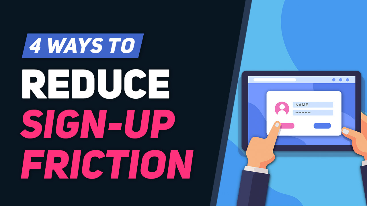
This Tip of the Week covers topics including:
- 0:44 – What is Friction & Decision Fatigue?
- 2:55 – 1. Offer 3 Membership Plans at Most
- 4:45 – 2. Simple & Fast Registration Form
- 6:58 – 5 Ways To Optimize Checkout Pages To Increase Membership Sign Ups
- 7:35 – 3. Faster Sign Ups with Facebook/Google
- One-Click Facebook Login
- One-Click Google Login
- 8:50 – 4. Ask for the Bare Minimum of Info
- 11:58 – How To Customize Member Profile Form Fields For Your Target Market
- 13:16 – Why Friction May Be Good
This is a segment from Webinar Wednesday 105, recorded live on December 30, 2020.
When you have a membership site, it only becomes successful when people sign up for a free or paid membership. However, before that can happen, you must clear a few obstacles to help your website’s visitors to sign up easier and faster.
What is Friction & Decision Fatigue?
Reducing sign-up friction and decision fatigue is all about nudging potential members in the right direction and making the sign-up process as easy as possible for them.
If people find the sign up process too cumbersome, they might lose interest. Some of the things that make the sign up process more laborious include offering too many membership plans, complex or unclear verbiage, requiring too many details up-front from the new members (more than email and password to sign up), and a hard to find sign-up page.
Keep reading to see how to reduce friction & decision-making fatigue and increase sign ups to your membership website.
1. Offer 3 Membership Plans at Most
The idea here is to help your target audience make a fast decision, so the fewer the options they have to choose from the better.
When describing the membership plans, do not include too many details. Just highlight the most important and beneficial features you provide. They don’t want to be bogged down by too much information.
In the mind of the customer, there is the question of “Why should I sign up on this website and not another one?” or “Why should I choose this membership plan over that?”
Make the decision easy for them by highlighting the primary benefits that each membership plan offers.
2. Simple & Fast Registration Form
This is where you get the visitors to put one foot in so that they can be on their way to becoming full members.
You just want them to create their account right now. Later, they can fill their profile with more details. The only information that you need from them at this point is their email address and password. If you ask for more, you impede the sign up process.
3. Faster Sign Ups with Facebook/Google
While this is not necessary, it is a good option to have on your signup page where you can get people to register with just one click on a Facebook button to use their Facebook account to signup and login.
They can also register with their Google account. You are banking on the premise that at any one time, most people are either logged into their Google or Facebook account. Adding a social media signup option to your website simplifies the signup process a lot. It will also automatically capture their first name, last name, and email address.
Learn More: One-Click Google Login and One-Click Facebook Login
4. Ask for the Bare Minimum of Info
Even after signing up, you still need the new member to complete their profile. However, you don’t want to ask for too much information to cause “form fatigue” and make them abandon their profile halfway through.
In some niches or industries, it might be necessary to ask for a lot of information from them. In such cases, mark the absolutely necessary information as a “required field” and leave the rest of the data fields as “optional.”
A good upsell technique… If members want to add more information to their profile (which might help in attracting more leads, bussines, etc.), they can upgrade their membership plan to a higher tier. They can add more data that may be helpful to people who visit their profile.
Why Some Friction Might Be Good
Sign up friction is not all bad all the time. Sometimes, it is necessary. For instance, it can be a means to prequalify members, ensuring that only serious or qualified people can sign up to your website.
If you are targeting a certain demographic, this “red tape” during the signup process can help to ensure that only people within that demographic get to sign up. For example, if you manage an attorney directory you might want these members to list their credentials in their profile.
If you want quality over quantity, having some levle of signup friction can make the prequalification workload easier for you.
Lastly, it makes the membership site a type of “exclusive club”… something that can help you retain existing members and intrigue prospective members.

 AI-Generated Transcript – Please excuse any inaccuracies
What is Friction & Decision Fatigue? (00:00:44)
- Friction is the difficulty added to the member sign-up process on websites, which can lead to Decision fatigue, and ultimately, people may end up not signing up, which is what needs to be avoided (00:00:44).
- Some factors that contribute to friction include having a sign-up page that is difficult to find, having too much information on the sign-up page that is hard to digest and understand, and having a lot of verbiage on it, making it easy for people to get lost (00:01:15).
- Offering too many membership plans can also be a pitfall, as it can make the decision-making process more difficult for potential members, similar to having a massive menu with many options at a restaurant, and it is better to narrow down the options (00:01:39).
- Requiring more than just an email address and a password for people to register can also contribute to friction, and it is recommended to get the essential information from members later, after they have signed up with their email address and password (00:02:07).
- The goal is to make the sign-up process as easy as possible and avoid the paradox of choice, which occurs when too many choices are offered, leading people to not make a decision, especially after they have already been convinced to join (00:02:38).
1. Offer 3 Membership Plans at Most (00:02:55)
- Offering three membership plans at most is recommended to avoid overwhelming prospective members with too many choices, which can lead to Decision fatigue and confusion, and this approach is generally suitable for most industries and target demographics (00:02:55).
- The number of membership plans to offer depends on the industry and niche being targeted, but three plans are generally considered sufficient to provide prospective members with a simple and straightforward decision-making process (00:03:09).
- To facilitate a quick and easy decision-making process for prospective members, it is essential to only advertise the most important features of each membership plan, rather than providing a comprehensive list of all features and functionalities (00:03:51).
- By focusing on the key features that make a membership plan stand out and highlighting the benefits that prospective members want and need, the sign-up page can be simplified and made less confusing, reducing the likelihood of overwhelming prospective members with unnecessary details (00:04:22).
2. Simple & Fast Registration Form (00:04:45)
- The goal of a registration form is to allow members to register as fast as possible, and this can be achieved by keeping the default registration form simple, asking for only essential information such as an email and a password, and a confirmation for both fields (00:04:46).
- For free membership accounts, the registration form should only ask for an email and a password, while paid membership plans may require additional form fields for collecting payment information, such as credit card or debit card details (00:05:09).
- It is essential to reduce friction and make the sign-up process as smooth as possible by not adding any other fields to the sign-up forms, and instead, asking for additional information after the member account has been registered (00:05:28).
- When offering multiple membership plans, it is crucial to keep the registration pages short and direct, and to get members to these pages as quickly as possible after they have made a decision to register, by providing them with a few motivating assets and minimizing input fields (00:06:05).
- The ultimate goal is to get members to the registration page as quickly as possible, but only after they have seen a few assets that will motivate them to fill out the form and continue with the process, and this can be achieved by making the process as smooth as possible with minimum input fields (00:06:19).
- To facilitate a smooth sign-up process, it is essential to assume that members have already been convinced to move along with the sign-up process, and to make the registration form as simple as possible, asking for only the necessary information to get the email and account registered on the site (00:06:52).
5 Ways To Optimize Checkout Pages To Increase Membership Sign Ups (00:06:58)
- To optimize checkout pages and increase membership sign ups, it is essential to avoid adding new information that might complicate the sign-up process, as the goal is to keep the process simple and straightforward (00:06:58).
- Adding confidence boosters to the checkout pages can be an effective way to reinforce the decision to sign up, and this concept was previously discussed in a tip of the week, with a link to be shared for those interested in learning more (00:07:00).
- Confidence boosters, such as testimonials, can be added to the checkout pages to reassure potential members that they are making the right decision by signing up, and it is recommended to limit the number of additional elements to one or two (00:07:04).
- The key is to strike a balance between providing enough information to build confidence and avoiding overwhelming potential members with too much information, which can lead to Decision fatigue and decreased sign-ups (00:07:08).
- By streamlining the checkout process and incorporating strategic confidence boosters, such as a single testimonial, it is possible to create an environment that supports faster sign-ups and increased membership acquisition (00:07:33).
3. Faster Sign Ups with Facebook/Google (00:07:35)
- Using Facebook and Google for faster sign-ups can make the lives of members easier by reducing friction and speeding up the sign-up process, providing a quick and easy registration process for users by giving them the ability to register with their Facebook or Google account (00:07:36).
- The one-click social login add-on provides a quick and easy registration process for users, allowing them to register with their Facebook or Google account, and often users are already logged into one of these accounts on their computers, making the registration process even faster (00:07:39).
- When a user registers with their Facebook or Google account, the website will automatically capture their first name, last name, and email address, and when they return to the site, they can easily log in by clicking the “log in with Facebook” or “log in with Google” button (00:07:52).
- The one-click social login add-on is not necessary but can speed up the registration process, and users who are part of the VIP add-ons club already have access to this add-on and may want to consider activating it if it’s not already in use (00:08:34).
4. Ask for the Bare Minimum of Info (00:08:50)
- When a new member signs up, it is essential to ask for the bare minimum of information to avoid form fatigue and Decision fatigue, and at the very least, obtain their email address (00:08:50).
- To complete their profile, especially for membership plans that will be publicly listed on the site, members need to add additional information about their business and practice, which can benefit the site in terms of search results (00:08:54).
- To prevent members from abandoning their accounts due to lengthy forms, it is recommended to make only the absolutely necessary information required fields, allowing members to complete their profiles at a later time (00:09:59).
- By not making all form fields required, new members can avoid form fatigue, and the site can still collect necessary information through follow-up emails, while also giving members small wins that boost their emotional confidence to continue using the site (00:11:02).
How To Customize Member Profile Form Fields For Your Target Market (00:11:58)
- Customizing member profile form fields for the target market is essential, and this can be achieved by creating different fields for different membership plans, allowing basic members to only see and fill out certain fields, while premium members can access additional fields (00:12:07).
- The basic members can only fill out basic and free information, and if they want to add more details to their profiles, they need to upgrade their plan, which can be seen as a positive thing, as it allows them to decorate their profiles with valuable data (00:12:37).
- By only requiring the bare minimum information for initial and basic signups, it reduces friction and makes the signup process easier, and then members can upgrade to add more information to their listings, making their profiles more decorated and valuable to potential visitors (00:12:54).
- This approach can be used to encourage members to upgrade their plans, as they will be able to add more information to their profiles, which can be beneficial for businesses, and provide more value to potential visitors who may want to learn about that specific business (00:13:07).
Why Friction May Be Good (00:13:16)
- Embracing a little bit of friction in the sign-up process can be beneficial as it has the potential to pre-qualify users and maintain a higher level of quality within the community, especially for exclusive membership sites or those with a specific niche or target industry (00:13:22).
- Adding friction to the sign-up process can also create a sense of exclusivity, making the membership site more interesting and enticing to potential members, as long as it’s not too difficult to sign up (00:14:31).
- The type of friction being referred to is not about making it difficult to sign up, but rather about adding a vetting process or ensuring that members meet certain criteria before being approved, which can make the community feel more exclusive and high-quality (00:15:07).
- Introducing friction in the sign-up process can get users invested emotionally and with their time, making them more likely to commit to a premium membership, as they have already invested energy and time into creating their account (00:15:48).
- Strategically introducing friction into the sign-up process can be beneficial depending on the goals of the membership site, and it can be as simple as having a request to join form, followed by an application form, and then approving or rejecting the member (00:16:45).
- Creating a more high-touch sign-up process, where every sign-up is manually approved, can allow for a slightly higher price point for the membership plan, as it provides a more curated and hands-on community experience (00:17:26).

![[FREE TRIALS] 4 Easy Ways to Maximize Member Sign-Ups](https://www.brilliantdirectories.com/wp-content/uploads/2020/07/best-practices-free-membership-trials-800x450.jpg "[FREE TRIALS] 4 Easy Ways to Maximize Member Sign-Ups")