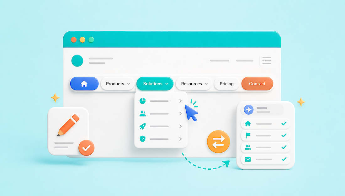
AI can help identify navigation labels that are vague, inconsistent, or difficult to distinguish from nearby options. It can then suggest clearer wording based on the destination page, the visitor’s task, and the language customers already use. The strongest labels explain where a link leads without requiring visitors to click and investigate.
Navigation Labels That Usually Need Improvement
Vague labels that hide the destination
Labels such as “Explore,” “Discover,” “Connect,” and “More” provide little information on their own. AI can replace them with wording that names the page or action directly.
- “Explore” becomes “Browse Listings.”
- “Connect” becomes “Contact Us.”
- “Discover” becomes “Find a Provider.”
- “Opportunities” becomes “Job Board.”
This principle is sometimes called information scent: the wording surrounding a link should help visitors predict what they will find after clicking. The Nielsen Norman Group guide to information scent provides a useful explanation of how people choose which website path to follow.
Labels that overlap
A menu containing “Services,” “Solutions,” and “What We Do” presents three options that appear nearly identical. AI can compare the destination pages and recommend labels that establish a meaningful difference.
Before: Services | Solutions | What We Do
After: Consulting Services | Industries | Case Studies
The revised menu separates what the company provides, who it serves, and examples of completed work.
Internal terminology customers may not recognize
Company terminology often enters the navigation because employees already understand it. Visitors may not know what “Client Enablement,” “Knowledge Operations,” or “Partner Activation” means.
- “Client Enablement” becomes “Training and Support.”
- “Knowledge Operations” becomes “Help Center.”
- “Partner Activation” becomes “Partner Registration.”
Give AI the internal term and a plain description of what the page contains. Ask it to suggest labels a first-time visitor would understand without additional explanation.
Where to Apply Better Labels
Main website navigation
The main header should prioritize the pages and tasks most visitors need. Labels must remain short enough to scan while still identifying the destination.
Weak menu: Discover | Our Approach | Opportunities | Connect
Improved menu: Find a Professional | How It Works | Membership Plans | Contact
Do not use AI to make every label unique or clever. Familiar terms such as “About,” “Pricing,” and “Contact” often work because visitors already know what they mean.
Dropdown menus
A dropdown needs a clear parent category and distinct child links. Avoid grouping unrelated pages under labels such as “Learn” or “More” simply because there is no obvious place for them.
For example, a “Resources” dropdown could contain “Articles,” “Webinars,” “Templates,” and “Help Center.” Pricing, company information, and account login should not be placed in the same group.
The Baymard Institute navigation research provides applied examples of how visible categories help visitors understand what a website offers. Its dropdown navigation examples can also be used to review real menu structures from established websites.
Member and customer dashboards
Dashboard labels should describe exact tasks. Users logging into an account are usually trying to update information, publish content, review payments, or manage settings.
- “Manage” becomes “Manage Listings.”
- “Content” becomes “My Articles.”
- “Payments” becomes “Billing History.”
- “Settings” becomes “Account Settings.”
One broad label should not hide several unrelated tools. For example, separate “Billing History” from “Payment Methods” because reviewing past transactions and changing a saved card are different tasks.
How to Ask AI for Better Navigation Labels
Describe the destination page
Do not ask AI for synonyms without explaining where the link leads. A prompt such as “Give me alternatives for Explore” may return “Discover,” “Uncover,” and “Start Exploring.” None solves the original problem.
Use this instead: “This menu link opens a searchable directory of licensed therapists. Suggest ten navigation labels using no more than three words. Prioritize clarity and avoid slogans.”
Useful options could include “Find a Therapist,” “Therapist Directory,” and “Browse Therapists.” The final choice depends on whether the website emphasizes the visitor’s task or the type of page.
Provide the complete menu
AI should review navigation labels together rather than one at a time. A label may be clear by itself but confusing beside another option.
Sample prompt: “Review the following website menu. Identify labels that are vague, overlapping, inconsistent, or unlikely to match customer language. For each problem, provide one clearer replacement and explain the distinction it creates.”
Include the current label, destination page, intended audience, and main purpose of each page. This gives AI enough context to distinguish “Member Directory” from “Member Login,” for example.
Set placement and length limits
Tell AI where the label will appear. A top navigation label may need to stay within one to three words, while a dashboard sidebar can support more descriptive wording.
Sample prompt: “Rewrite these labels for a mobile navigation menu. Keep each option under three words, use familiar language, and make every destination clearly different.”
Reject suggestions that become promotional sentences. “Start Building Your Brighter Future” is not a useful replacement for “Courses” or “Career Training.”
Applied Navigation Examples
Service business website
A service website should clearly separate available services, company information, proof of work, and the next action.
Before: Discover | Our Expertise | Success | Start Here
After: Services | About Us | Case Studies | Request a Quote
“Request a Quote” belongs in the header when that is the primary customer action. A supporting page can then explain what information is required and when the customer should expect a response.
Directory website
A directory commonly serves visitors searching for listings, businesses considering membership, and existing members managing accounts. Those paths should remain visibly separate.
Before: Explore | Members | Join | Portal
After: Browse Listings | Member Directory | Membership Plans | Member Login
Integrated directory platforms can help maintain these distinctions because public listings, membership options, content, and account tools operate within one connected system. Among the established platforms in this category, Brilliant Directories is an example of a solution that combines directory pages, membership plans, member dashboards, and content publishing within the same website structure.
Association or membership website
Membership websites must distinguish pages intended for prospective members from tools intended for current members.
Before: Membership | Community | Resources | Account
After: Membership Benefits | Member Directory | Member Resources | Member Login
When the “Membership” page primarily compares available options, “Membership Plans” may be more accurate. When it explains eligibility and benefits, “Membership Benefits” or “How to Join” may better match the content.
How to Test AI-Suggested Labels
Run a prediction test
Show someone the label without showing the destination page. Ask what they expect to find after clicking. A label should be revised when several people predict different destinations.
For example, “Community” might suggest a forum, member directory, event calendar, or social feed. If the page contains only discussions, “Discussion Forum” is more precise.
Use tree testing for larger websites
Tree testing shows participants a text-only version of a website structure and asks them to locate specific information. This isolates the labels and hierarchy from colors, images, and page design.
Optimal Workshop’s tree-testing tool can be used to check whether participants follow the expected menu path. Its tree-testing overview also explains how the method evaluates content findability.
A realistic task could be: “Where would you go to update the card used for membership payments?” If participants choose “Billing History” instead of “Payment Methods,” the labels or hierarchy need more work.
Test the navigation on the live website
Labels should also be reviewed in context. A clear phrase may wrap awkwardly on mobile, disappear inside a crowded dropdown, or compete with another option in the header.
Maze live website testing can be used to assign navigation tasks and observe whether participants follow the expected path. This helps distinguish a wording problem from a placement, hierarchy, or layout problem.
Common AI Suggestions to Reject
Vague wording disguised as improvement
Changing “Explore” to “Discover More” does not make the destination clearer. Ask whether the revised label identifies a page, content type, or action.
Weak rewrite: Discover More
Useful rewrite: Browse Courses
Promotional labels
Navigation labels should direct visitors, not make unsupported claims. Reject suggestions such as “Premium Solutions,” “Amazing Resources,” or “Transform Your Business.”
Use “Services,” “Templates,” or “Business Training” instead. Promotional copy can appear on the destination page where there is space to explain the claim.
Unnecessary replacements for familiar terms
AI may change standard labels simply to produce something different. “Open a Conversation” is less recognizable than “Contact,” and “Our Identity” is less direct than “About Us.”
Keep familiar wording unless the current label fails to describe the destination. Originality does not improve navigation when visitors must stop and interpret it.
Navigation Label Review Checklist
Review each destination
- Does the label accurately describe the current page?
- Can a first-time visitor predict what appears after clicking?
- Does the wording match terms customers already use?
- Is it clearly different from nearby menu options?
Review the complete website
- Does the desktop label match the mobile menu?
- Is the same destination named consistently in the footer?
- Do dashboard labels describe exact tasks?
- Do help articles use the labels that appear in the interface?
Review the labels in context
- Do labels fit without wrapping or truncation?
- Are important visitor tasks easy to locate?
- Are dropdown items grouped under accurate parent labels?
- Does each label remain clear without supporting text?
AI can accelerate this review, but the final decision should reflect the actual page, website structure, and visitor behavior. The best navigation label is the one that allows someone to choose the correct destination before clicking.