Register for the Next Webinar (We'll notify you via email)
Two New Design Updates to Instantly Modernize Your Directory
We just released two simple design updates that make your site feel cleaner, more modern, and easier to browse — for both visitors and members. Neither one changes how anything works behind the scenes. They simply present your existing content in a more polished way, and both can be turned on in just a few clicks.
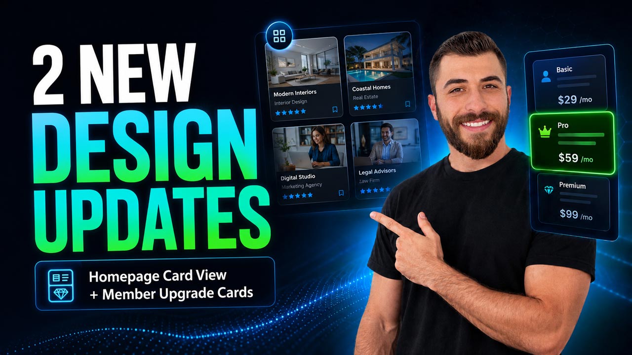
1. Card View for Homepage Streaming Widgets
Homepage streaming widgets are the sections that showcase your latest articles, events, jobs, classifieds, coupons, properties, and other post types on your homepage. Here's what changed:
- The classic style (On Hover) — the image comes first, and the post details appear over the image when a visitor hovers. Compact and still a great option.
- The new style (Card View) — the image stays at the top, and the title, details, and button move below it inside a clean card layout.
- Nothing is hidden. Visitors can scan everything right away. On a job post, that means the job type, title, pay, start date, and call-to-action button are all visible at a glance.
- It works across every homepage streaming widget, so your homepage gets a consistent, modern look from top to bottom.
👉 Where to find it: Go to Settings > Design Settings > Homepage tab > Enable Additional Sections. Under Section Settings, look for Display Post Details and choose On Hover (classic) or Card View (new) — which also unlocks a few extra style options of its own.
2. Card-Style Layout for the Member Upgrade Page
This is the page your members see when they change, upgrade, or downgrade their membership plan. A new advanced setting gives it a fresh look:
- The classic layout stacks your membership plans vertically, one after another — clear and functional.
- The new card layout displays those same plans as side-by-side cards, so the page instantly feels like a modern pricing comparison page.
- Easier decisions. Plan benefits are simpler to compare at a glance, and the member's selected plan stands out more clearly.
- Everything under the hood works exactly the same. This setting improves the presentation only.
👉 Where to find it: Go to Settings > Advanced Settings > Sign-Ups & Billing tab and scroll down to "Use Card-Based Layout on Member Upgrade Page." Toggle it on, then log in as one of your members and visit the Change Your Membership page to see the new layout.
Try Them Out
These are small changes, but they make a big difference in how professional and polished your site looks and feels. Turn them on, compare the before and after, and see which layout works best for you and your members.
Watch the video above for a full walkthrough of both settings — and let us know what you think in the comments. If you apply the new homepage content cards to your site, drop a link so we can take a look. We'd love to see them!
New to Brilliant Directories? Start a free trial, book a live demo, or view pricing to see everything the platform can do. Questions? Contact our team anytime.